

Half-Half Color Block
The Half-Half Color Block component is a contained section of text content. It is a web execution of the same Half-Half Color Block layout from our social media design system. It can be used with either an image or video.
Heading
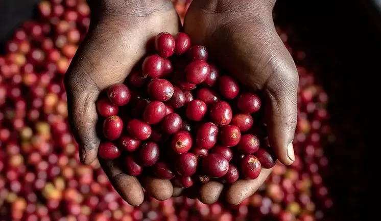
Title
This is the body field.
Lorem ipsum dolor sit amet, consectetur adipiscing elit, sed do eiusmod tempor incididunt ut labore et dolore magna aliqua.
Ut enim ad minim veniam, quis nostrud exercitation ullamco laboris nisi ut aliquip ex ea commodo consequat. Duis aute irure dolor in reprehenderit in voluptate velit esse cillum dolore eu fugiat nulla pariatur. Excepteur sint occaecat cupidatat non proident, sunt in culpa qui officia deserunt mollit anim id est laborum.
See below for more variants.
When to use
You should use this component on pages that are intended to be content-rich pages for our audiences. This component is more likely to be used on Information pages.
You should use this component when you can easily break down a part of the narrative into a ‘chunk’ of information for our website users. Aim to only use this component when you have an impactful and relevant image or video that gives additional context.
How to use
Text fields
- The Title should be an engaging title that draws the user in
- The Body should give users a brief but meaningful amount of information
Background color
- Oak is the default and is recommended for most use cases, as it does not overpower the user with color, however brighter colors can also be used.
- Strategic color choices such as impact area colors or Pink for the Careers section are also desirable.
Color block position
- Select Left or Right depending on your desired appearance for desktop devices.
- This component is intended as content and not discoverability, so there are no CTA fields. However, where necessary and useful to users you can add a hyperlink into the body.
Additional considerations
- The component will always be full width
- The video always opens in a lightbox
- Recommended optional heading length: 20 - 50 characters (max. 80)
- Recommended title length: 20 - 50 characters (max. 80)
- Recommended item body length: 350 - 500 characters (max. 700)
- Recommended image size: 960 x 540 pixels (16:9 ratio)
- Recommended video thumbnail: 16:9 ratio
Always be mindful of the recommended character counts for text, as going above or below this can create an inconsistent experience for our users depending on which device they are using.
Variants
Half-Half Color Block with Video

Title
This is the body field.
Lorem ipsum dolor sit amet, consectetur adipiscing elit, sed do eiusmod tempor incididunt ut labore et dolore magna aliqua.
Ut enim ad minim veniam, quis nostrud exercitation ullamco laboris nisi ut aliquip ex ea commodo consequat. Duis aute irure dolor in reprehenderit in voluptate velit esse cillum dolore eu fugiat nulla pariatur. Excepteur sint occaecat cupidatat non proident, sunt in culpa qui officia deserunt mollit anim id est laborum.
Half-Half Color Block with Image

Title
This is the body field.
Lorem ipsum dolor sit amet, consectetur adipiscing elit, sed do eiusmod tempor incididunt ut labore et dolore magna aliqua.
Ut enim ad minim veniam, quis nostrud exercitation ullamco laboris nisi ut aliquip ex ea commodo consequat. Duis aute irure dolor in reprehenderit in voluptate velit esse cillum dolore eu fugiat nulla pariatur. Excepteur sint occaecat cupidatat non proident, sunt in culpa qui officia deserunt mollit anim id est laborum.
