The evolution of the Nestlé logo
The story of our iconic logo
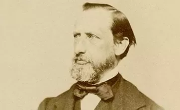
Henri Nestlé’s original Nestlé trademark was based on his family's coat of arms, which featured a single bird on a nest. In time, Nestlé added three young birds being fed by a mother, to help create a link between his name and the products he’d created.
Since it was trademarked in 1868, the Nestlé logo has gone through many changes. However, the iconic nest still sits on Nestlé brands worldwide.
See how our logo has evolved over the years.


Pre-1868
Where it all began
Henri Nestlé’s first trademark is based on his family's coat of arms. It features a bird on a nest, which is a reference to the family name, meaning ‘nest’ in German.
1868
Henri Nestlé uses his coat of arms as inspiration for the company's new logo. He adds three baby birds into the nest, which are being fed by their mother. This new image links his family name to his infant cereal products and helps protect his brand from imitators.
1938
The Nestlé lettering and logo are now combined to create an umbrella brand icon. This becomes the unifying distinguishing mark for different Nestlé brands across the world.
1966
The combined trademark is evolved in celebration of the Nestlé company's 100th anniversary. It features a new font and a modernized image.
1988
Nestlé product categories are given standardized names in combination with the Nestlé signature. The logo image is reduced to two young birds and the brand lettering is placed underneath. This now becomes the strategic umbrella trademark for the company.
1995
The Nestlé logo is simplified and modernized again. While the company's four product categories, milk, ice cream, confectionery and baby milk, are each given specific Nestlé lettering.
2015
The logo design is simplified and softened. This makes it easier to read on modern digital devices like tablets and smartphones.
2018
In 2018, the color of the Nestlé logo was changed from gray to oak brown. This better reflected the color of the tree branch and gave the logo more warmth.