

Product Showcase Carousel
The Product Showcase Carousel is an interactive, content-focused component that gives our audiences a brief overview of different products in a range.

Product Showcase Title
Product Showcase Call to Action
Product title 1
Product description

Product title 2
Product description

Product title 3
Product description
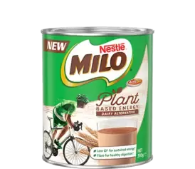
Product title 4
Product description

Product title 5
Product description
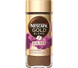
When to use
We should use this component on Information pages (see section 3.13.2 of Website design guidelines), when we want to give our website users an overview of the range of products that our brands provide, or for special use-cases, such as showcasing plant-based products.
Note: This component does not link to product pages. There is no CTA field as this component should be content-focused.
How to use
There are various fields within this component:
- Title: For introductory explanatory text.
- Call to action: For a non-clickable text call-to-action.
- Logo image: You have the option to upload a brand logo which appears in the centre of the component. If you do not upload a logo, a Nestlé logo will appear by default.
- Background image (optional): You also have the option to upload a background image, then select a text colour (dark oak or white) that will ensure the best legibility.
- Text colour: Dark oak (default) or White.
- For each item you want to showcase in the carousel, you will need:
- Product title
- Product description
- Product image
Main considerations with this component
Selecting a logo image
- For best results, the image should be cropped as a square - the same appearance as the brand's social media profile image.
Selecting a background image
- The default background colour will appear as 15% Oak if you do not upload a background image. The background colour cannot be changed.
- Do not use background images that are very busy.
- Do not use background images that have products in them.
- You should aim for something that is expressive but not distracting, like a texture, shape or abstract image that is appropriate for the brand or context.
Selecting a text colour
- If you select a background image is dark in appearance, then you should select white text colour.
- If you select a background image is light in appearance, then you should select dark oak text colour.
Writing a CTA
- You should write a short text that would guide the user to click on the products below. For example, 'Explore the range' or 'Explore the products'.
Selecting a product image
- Product images should always be PNG with a transparent background. Most brands should have these on their website, however in some cases you may have to source or remove the background on images.
Writing content for the Product Description text
- This can be a shortened version of the product's description on the brand website or marketing materials.
- Always ensure that the content is relevant to the context of the overall page.
- Ensure it is written from Nestlé's perspective, rather than the brand's voice. For example, 'Nespresso' not 'We'.
Additional considerations
- Recommended Title length: 20 - 30 characters (max. 50)
- Recommended Call to Action length: 10 - 20 characters (max. 30)
- Recommended Logo image size: 150 x 150 pixels (1:1 ratio)
- Recommended Background image size: 1920 x 1080 pixels (16:9 ratio)
- Recommended number of items in carousel: 2 - 12 items (no maximum)
- Recommended Product title length: 5 - 20 characters (max. 30)
- Recommended Product description length: 120 - 250 characters (max. 350)
- Recommended Product image size: 462 x 400 pixels (maximum 492 x 400 pixels for images that are very horizontal)
Examples
See this component in use:
Nescafé brand page
Nespresso brand page
Plant-based portfolio
