Feature Banner
The feature banner displays a color banner with a message and a link off to another key page or document. This component has an optional image and can use the Nestlé Brush font.
See below for more variants.
When to use
This component should mainly be used at the bottom of a page.
This shouldn't be used as the generic next step, that is better suited to cards or the related content component. This should be used for a more strategic message and included in multiple pages within a section of the website.
An example use case for this component would including a banner at the bottom of each page within the Our impact section linking to the full 'Creating Shared Value' report.
How to use
This component has full-width or contained variants, and it has two image variations:
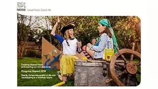
- Feature banner with image is typically used for document cover images
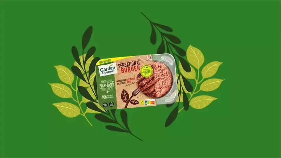
- Feature Banner Image Right 50% is typically used for photography or graphics
You have the option to use Nestlé Brush font to highlight particular words.
Additional considerations
- Maximum text length using Nestlé Text: 75 characters
- Maximum text length using Nestlé Brush: 45 characters
- Maximum button text length: 15 characters
- Recommended image size (document cover image): 320 x 180 pixels
- Recommended image size (Image Right 50% variant): 960 x 540 pixels
- If you use a transparent PNG with the Image Right 50% variant, the feature banner color will appear below your cutout image
Variants