

Page headers
We have a range of page heading styles that can be used across our websites. These different heading styles should help us establish:
-
Emotional connection. In the right places, our page headings should help set the tone and start building an emotional connection. This is most often done with the use of large imagery, color and our Brush font.
-
Hierarchy. Our websites have multiple levels of hierarchy. We want to do everything we can to ensure users know where they are within our site and don’t feel lost. Strong navigation is the biggest part of that, but page headers can also be used to create consistency at different levels. Users that spend time on our site will pick this up as an indicator of where they are.
Here we introduce the different page heading styles and provide guidance on when to use which style. Every page on your website will use one of the following page headers, with the exception of your Homepage and your Search for jobs page.
- Hero Image Header or Video Header (Bottom)
- Hero Image Header or Video Header (Side)
- Banner Header
- Story Header
- Brand Header
- Article Header
- Careers Header
Hero Image Header or Video Header (Bottom)
The Hero Image Header (Bottom) is a full-width image with text placed at the bottom of the image.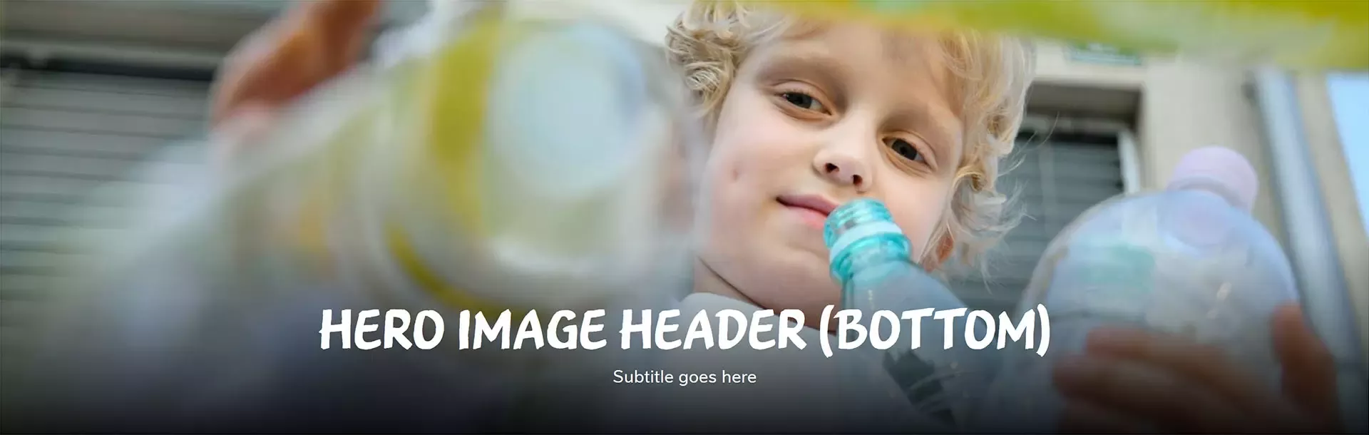
If you have a great video to promote early in the page, you can use the Video Header (Bottom).

When to use
You must use this header style on all first level pages. You should not use this particular style on any other pages.
How to use
Title text can be in Nestlé Text or Nestlé Brush. When deciding which typeface to use, consider the content on your page. Nestlé Text is designed to convey confidence, clarity and precision. Nestlé Brush is more distinctive and used to make our words or actions stand out. We recommend using Nestlé Brush on all first level pages (except Media and Investors).
Additional considerations
- Use engaging images of people with Nestlé brands where possible
- Recommended title length: 10 - 20 characters (max. 35)
- Recommended sub-title length: 40 - 60 characters (max. 90)
- The subtitle field is optional but recommended
- Recommended image size: 1920 x 800 pixels
Example
See this header style in use:
Brands – Hero Image Header (Bottom)
Our impact – Video Header (Bottom)
Hero Image Header or Video Header (Side)
The Hero Image Header (Side) is a full-width image with text placed on the left side (on desktop).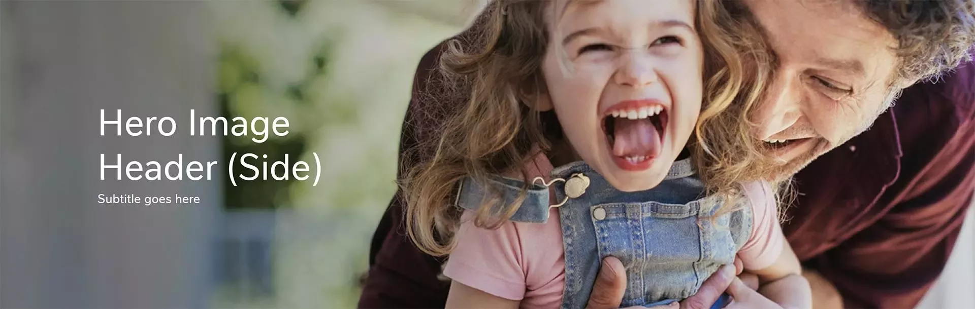
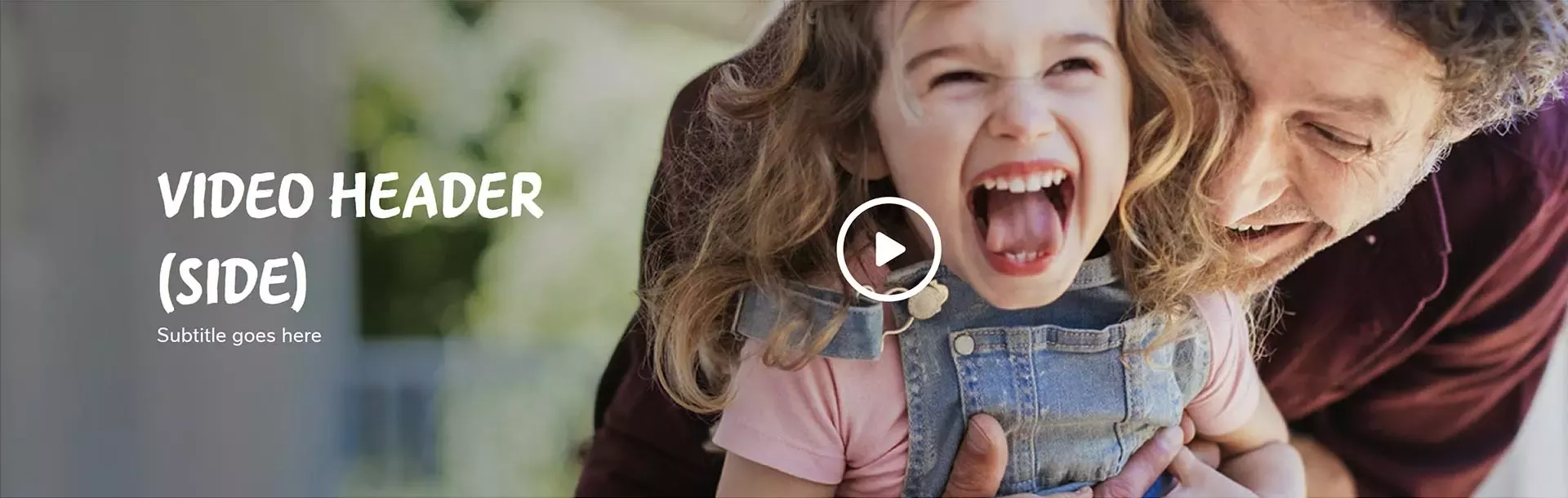
As above, if you have a great video to promote in your header, you can use the Video Header (Side).
When to use
This header style is well-suited for pages towards the beginning of the user journey where you want to make a visual impact. We recommend using it for level 2 pages.
How to use
Title text can be in Nestlé Text or Nestlé Brush. When deciding which typeface to use, consider the content on your page. Nestlé Text is designed to convey confidence, clarity and precision. Nestlé Brush is more distinctive and used to make our words or actions stand out.
Additional considerations
- Use images of people with Nestlé brands where possible. Consider how you crop your image as well as the focal point you define in the CMS. Avoid text on faces.
- Recommended title length: 10 - 20 characters (max. 20)
- Recommended sub-title length: 40 - 60 characters (max. 90)
- The subtitle field is optional but recommended.
- Recommended image size: 1920 x 800 pixels
Example
See this header style in use:
Our commitments – Hero Image Header (Side)
Global youth initiative – Video Header (Side)
Banner Header
The Banner Header takes up less vertical space than the Hero Image Header or the Video Header. It has a colored block on the left and a smaller image on the right.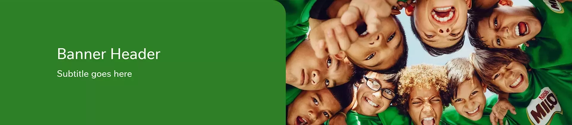
When to use
This header style should only be used on functional pages. In other words, on pages where users are taking a specific action e.g. filling in a form or searching for something specific (an office location, a media contact, a document etc.)
How to use
Title text can be in Nestlé Text or Nestlé Brush. When deciding which typeface to use, consider the content on your page. Nestlé Text is designed to convey confidence, clarity and precision. Nestlé Brush is more distinctive and can be used to make our words or actions stand out.
When selecting the color for the color block, try to match it with an accent color from the image.
Additional considerations
- Use images of people with Nestlé brands where possible
- Recommended title length: 10 - 20 characters (max. 25)
- Recommended sub-title length: 40 - 60 characters (max. 90)
- The subtitle field is optional but recommended
- Recommended image size: 960 x 512 pixels
Example
See this header style in use:
Contact us – Banner header with Nestlé Brush font
Media contacts – Banner header with Nestlé Text font
Story Header
The Story Header is similar to the Hero Image Header, but with a more impactful hero image. The larger hero image has significant presence on the page and sets the tone for the content that follows. A subtle animated scroll indicator below the subtitle encourages readers to scroll down the page to read the story.
When to use
This header style is reserved for Story pages only. It cannot be used on other page types.
How to use
When selecting the hero image for your story, take the time to find great images that spark the reader's interest, help to tell the story and create an emotional connection.
Additional considerations
- Recommended title length: 10 - 20 characters (max. 35)
- Recommended sub-title length: 40 - 60 characters (max. 90)
- Recommended image size: 1920 x 1080 pixels
Example
See this header style in use:
Story page
Brand header
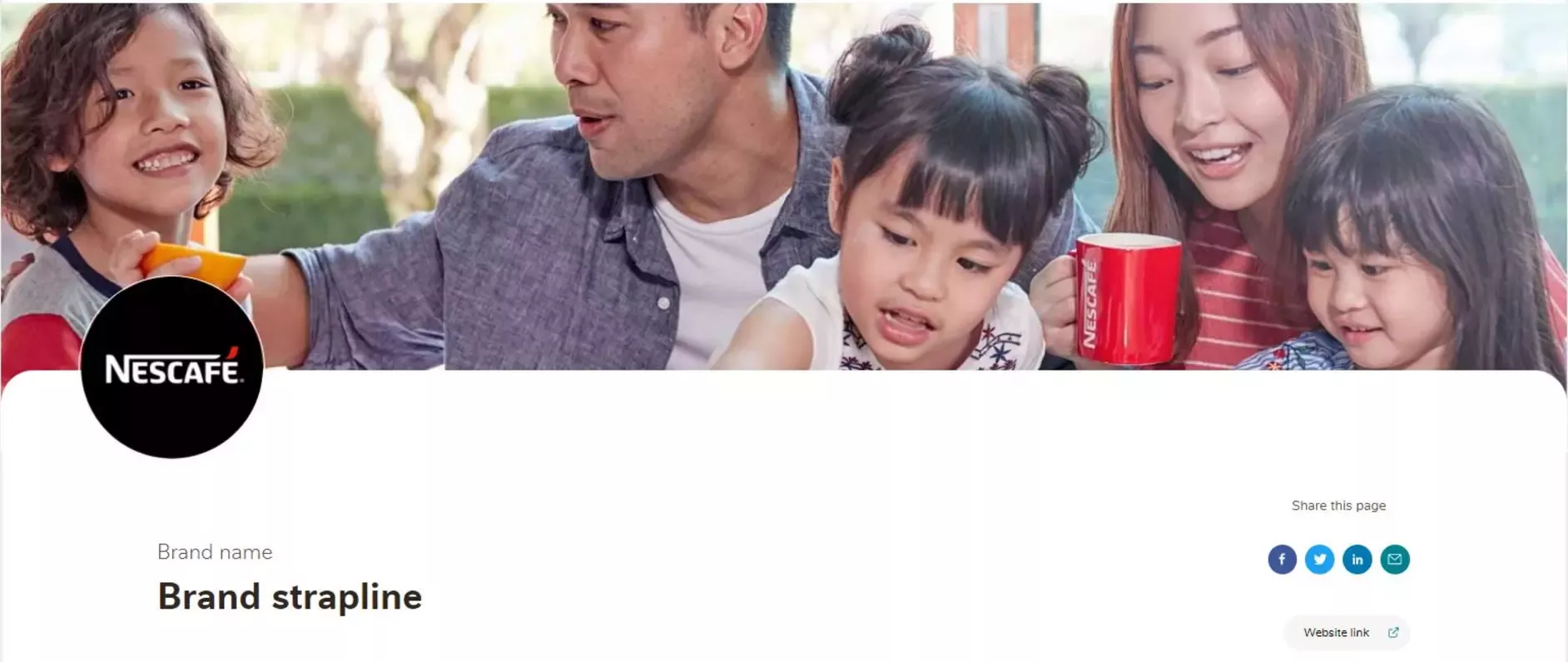
The Brand Header is a header style that has specifically been created for use only on individual brand pages, for example, Nescafé, Maggi, KitKat.
When to use
This header style is reserved for Brand pages only. It cannot be used on other page types.
How to use
This header style contains a number of different elements:
1. Background image
- Aim for lifestyle product photography. Photography with people can be used depending on whether the image crop would cut through their faces across different device sizes.
- Avoid images that include any marketing or advertising text within the image.
- If no background image is uploaded, the background of the header will default to 15% Light Oak.
2. Logo
If no logo is uploaded, the Brand page will appear with no logo in the header as default.
3. Title
This is the brand name.
4. Brand strapline
The Brand strapline is a bold, introductory statement about the brand that our users will first see when they land on a brand page. This text content does not necessarily need to be the official strapline of the brand, however guidance and messaging inspiration from the brand should be taken into consideration.
The strapline should be written from the perspective of Nestlé, not the brand. For example:
Incorrect: We are the world's favourite coffee
Correct: The world's favourite coffee
The strapline should avoid including the brand name since the brand name will appear in relation to the strapline in most cases. For example:
Incorrect: Enjoy Nespresso barista-style coffee
Correct: Now anyone can craft barista-style coffee
5. Website link
The Website Link field should be used for the primary web address that is most appropriate to direct our consumer audiences towards. An exception to this may be our Foodservice categories, where a professional or corporate website may be more appropriate for the audience.
- If the brand has a geolocation defaulting website, then the [brandname].com web address should be added as the primary web address.
- If the brand does not have a geolocation defaulting website, but has a local website for that brand (for example [brandname].fr) use this as the primary web address.
- If the brand does not have a website in that local market, the website should use one of the following in order of availability:
- [brandname].com web address
- No web address
Additional considerations
-
Recommended logo ratio: 1:1
-
Recommended brand strapline length: 40 - 70 characters (max. 80)
-
Recommended text length for primary website address: 20 - 35 characters (max. 50)
-
Recommended header image size: 1920 x 1080 pixels (16:9 ratio)
-
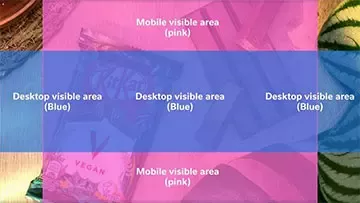
When selecting a header image consider what areas will be visible on which devices. Ensure that the product(s) are always visible. If the image would crop away too many products or through subject faces, consider using another image. The area where the blue and pink rectangles cross over indicates the area of the image that will mostly always be visible on large desktop devices. Testing how the header image looks on desktop and mobile devices is always recommended before committing to the image.

Examples
See this header style in use:
Nescafé brand page
Nespresso brand page
Starbucks At Home brand page
Article Header
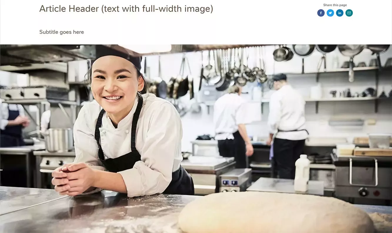
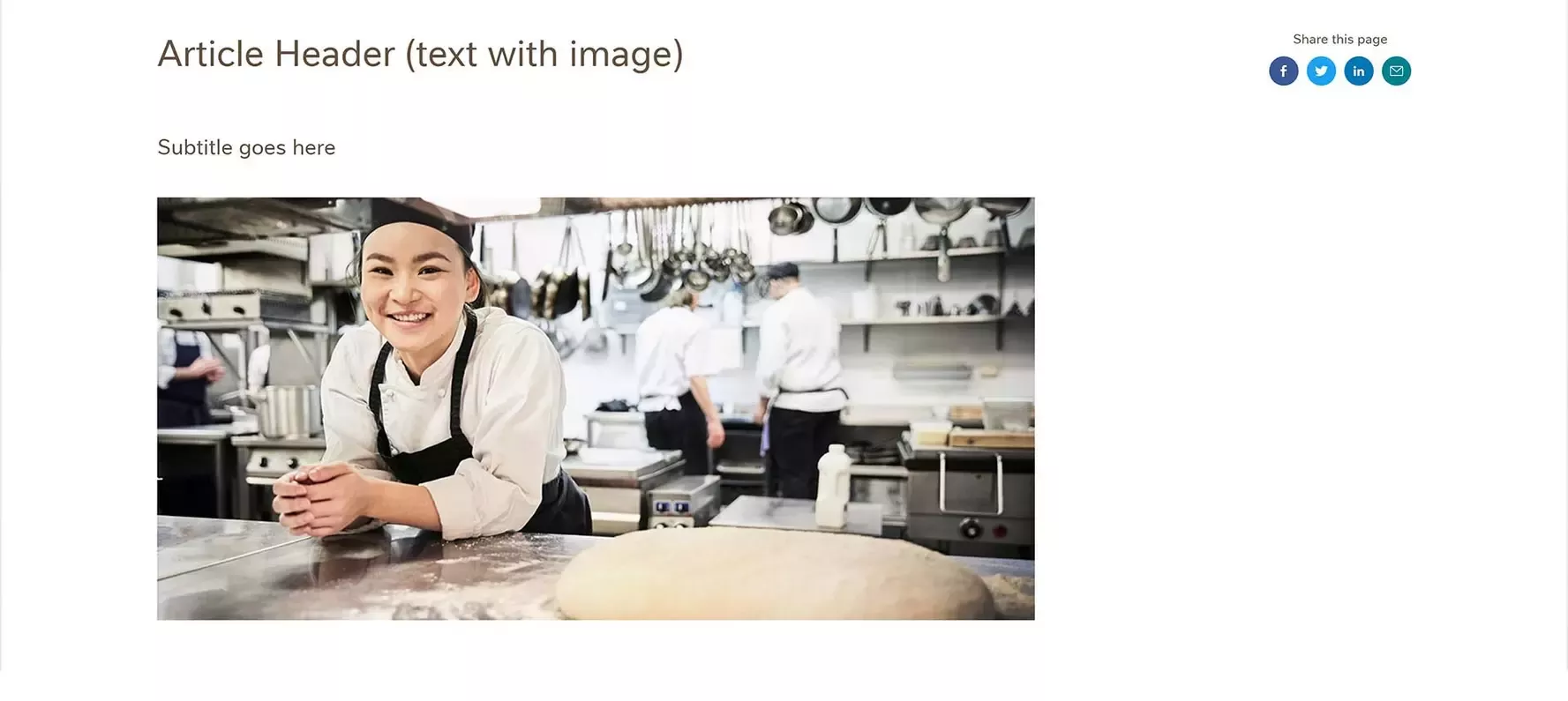
The Article Header comes in three different variants: text with full-width image, text with image, and text only.
When to use
Pages at the end of the user journey (commonly level 3 or level 4 pages) should always use the Article Header.
How to use
If making a visual impact is important, use the full-width image version. For pages that are purely informational and simple, use the text only version.
Additional considerations
- Recommended title length: 10 - 20 characters
- Recommended sub-title length: 40 - 60 characters
- Recommended image size (image): 1075 x 519 pixels
- Recommended image size (full-width image): 1920 x 927 pixels. NOTE: The CMS currently forces the proportion of the full-width image to be quite high. We are currently reviewing this. For now, if you want to use a full-width image on an article page, we recommend using an Image component with an image that is 1920 x 600 pixels (rather than the image field in the header).
Example
See this header style in use:
Driving new behavior – Article Header (full-width image)
News article – Article Header (image)
Copyright – Article Header (text only)
Careers Header
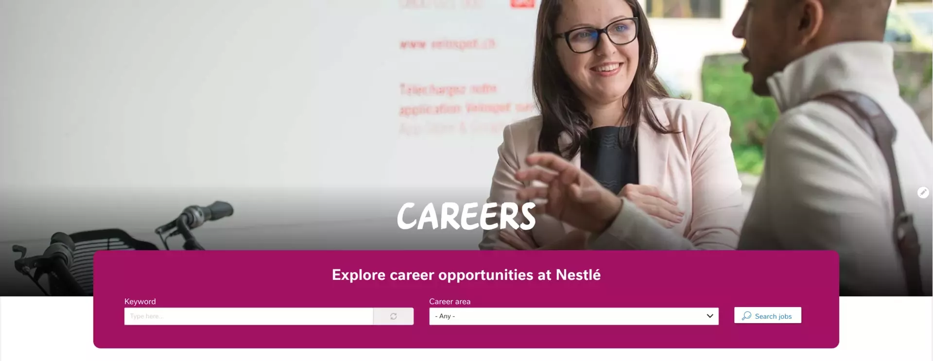
The Careers Header is a block that is used together with a Hero Image Header to quickly get users into the job searching journey.
When to use
This header style should only be used on the Careers gateway page.
How to use
This header style is achieved by adding a Hero Image header and then placing the relevant block. The block component should be placed at the top of the page.
Additional considerations
This header should use the approved wording (or direct translation) and should be applied consistently across every market website.
Example
See this header style in use:
Careers
