The evolution of the Nestlé logo
The story of our iconic logo
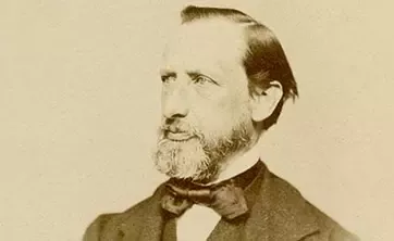
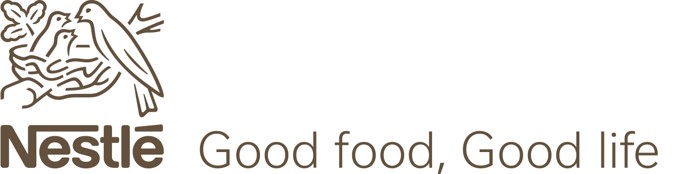
Henri Nestlé’s original Nestlé trademark was based on his family's coat of arms, which featured a single bird on a nest. In time, Nestlé added three young birds being fed by a mother, to help create a link between his name and the products he’d created.
Since it was trademarked in 1868, the Nestlé logo has gone through many changes. However, the iconic nest still sits on Nestlé brands worldwide.
160 years of care, nutrition and trust
Discover the history of the Nestlé logo, the values it represents, and how it continues to connect our brands, products, employees and consumers around the world.
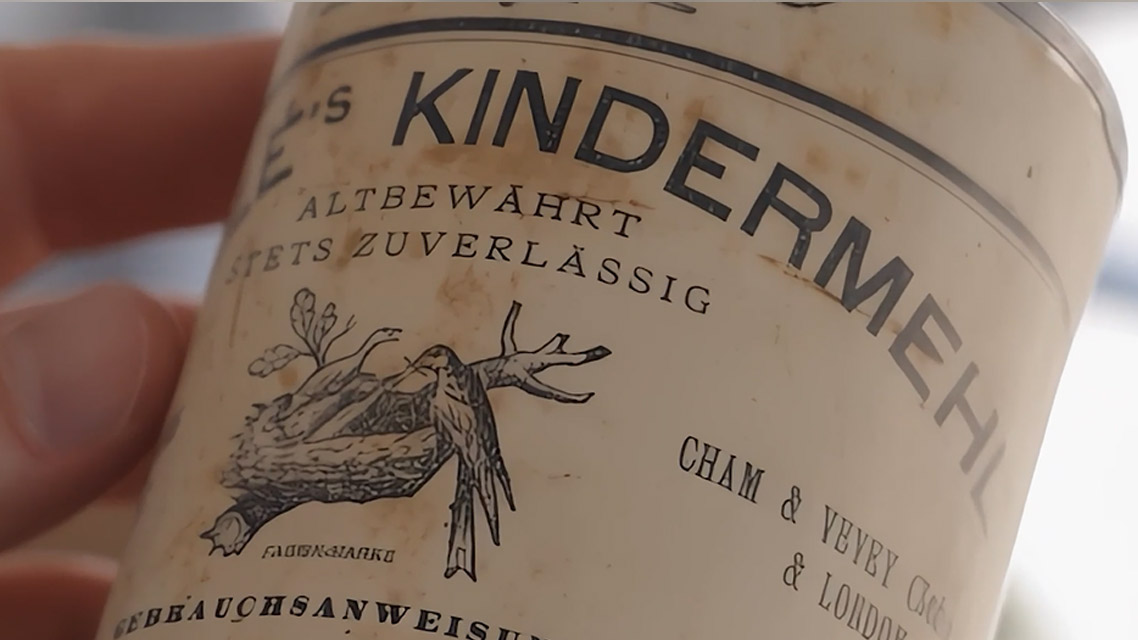
Created by Henri Nestlé, our nest embodies and anchors our values. Over 160 years, it has remained true to itself: Only design adaptations have allowed it to evolve, in step with the times.
Our logo’s role is to express the values that define our identity, such as care, nutrition, and trust. To bring together Nestlé’s many brands, and to serve as a seal of quality for our products. It brings unity to diversity and conveys a universal message, shared across all cultures.
Henri Nestlé chose the nest as a unique sign, so that his product could be recognized at a glance everywhere around the world.
It all started here. And for 160 years, the nest has carried Henri Nestlé’s original promise: care, nutrition, and trust. In every country.
The design of our logo has evolved through the ages while remaining clear and recognizable. But the essence has not changed: evolution and simplification, instead of revolution. Hundreds of more radical logo variations have been tried, but none have ever been accepted.
Our logo represents invaluable brand equity. It strengthens our reputation and builds consumer confidence. With more than 2000 brands and products sold in 185 countries, it provides stability and serves as a seal of quality.
The nest evolves, but remains a solid, emotional foundation. It creates connection for consumers as well as for employees and it reminds us of our responsibility: to earn trust today and carry it into the future.
END OF TRANSCRIPT
See how our logo has evolved over the years


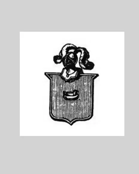
Pre-1868
Where it all began
Henri Nestlé’s first trademark is based on his family's coat of arms. It features a bird on a nest, which is a reference to the family name, meaning ‘nest’ in German.
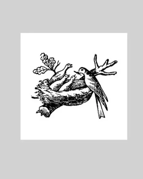
1868
Gifted with a strong instinct for marketing, Henri Nestlé choses a symbol featuring baby birds being fed in a nest for the label of his groundbreaking infant cereal (Farine Lactée). The logo is inspired by his family coat of arms, as 'Nestle' means small nest in German. The trademark is registered in Vevey in 1875 and has been protected since 1880.
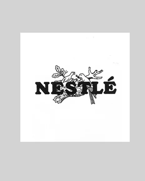
1938
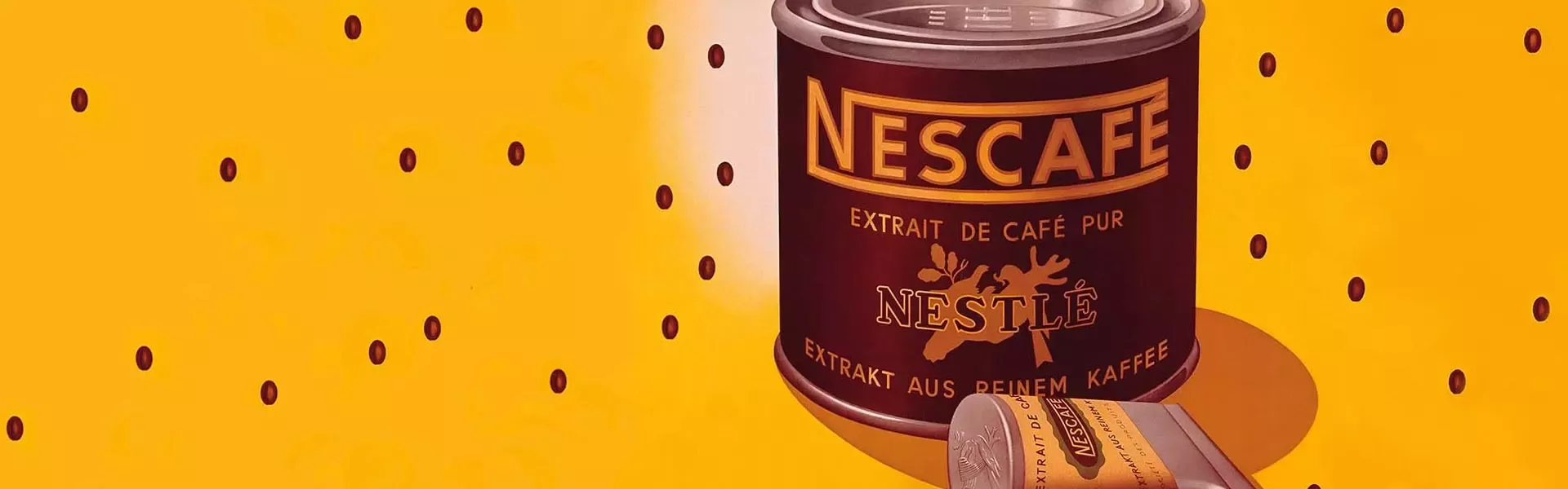
The Nestlé lettering and the symbol are combined to form a global brand, a distinctive mark that connects most of the Group's products including the newly launched Nescafé. This decision supports marketing for brands such as Lactogen, Pelargon or Eledon, now sold under the umbrella of Nestlé.

1966
The logo - then referred to as the 'combined mark' - is modernized to celebrate Nestlé's 100th anniversary. It is primarily used on the side or the back of packs as a seal of tradition. A 'universal logotype', based on the Nestlé chocolate brand, is adopted in 1973 for all product categories and as the Company's corporate logo.
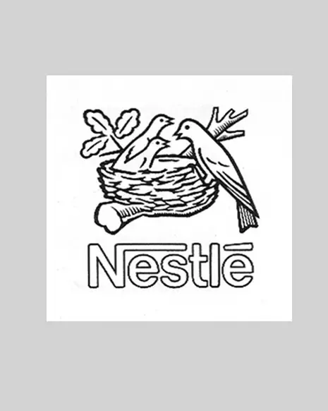
1988
The emotional expression of the bird's nest and the values it conveys start to be systematically linked to the Group's brands. The logo is simplified - notably by removing one of the baby birds - and becomes Nestlé's global corporate brand. The nest symbol and wordmark are now separated for more clarity and have equal weight.
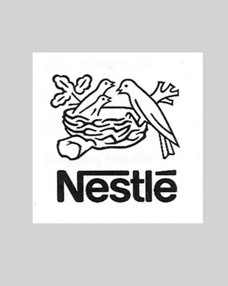
1995
The corporate brand continues to evolve with further simplification: the wordmark's outline and several details are removed. Special lettering applications are introduced, with distinct logo shapes for categories sold under the Nestlé umbrella, such as milk, ice cream, confectionery and infant nutrition.
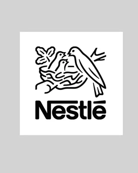
2015
To mark Nestlé's 150th anniversary in 2016, the logo is adapted for use in modern communications: more details are removed to ensure readability on smartphones and small screens. The new design gives greater prominence to the nest.
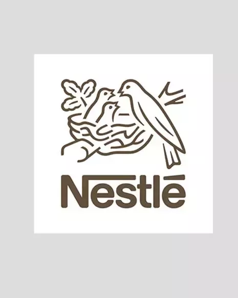
2018
In 2018, the color of the Nestlé logo was changed from gray to oak. This better reflected the color of the tree branch and gave the logo more warmth.